How to Choose the Right Gray Paint Color--Three Perfect Shades

After a brief hiatus, I’m back to blogging and happy as can be—both professionally and personally (I have the sweetest 3-month old baby boy… I might be a tad biased, though!). In any case, I started the last series of blogs with how to choose the right white paint color, so I thought it would be fitting to write about the hottest paint color of the moment. Gray is here, there and everywhere. You can’t escape it and you know you want to try it, but how? It’s a tricky color—go too far one way and you end up with olive green walls, go the other way and purple is all you see.
Painting the walls gray is an inexpensive way to change the look of your space. However, it’s not so inexpensive when you have to repaint several times because you didn’t pick the right gray. Here’s the secret: It’s all about the undertone. Is it purple, green or brown? Go to your paint fan deck and at the bottom of each strip is the most saturated version of that colorway. If you see black, the lightest gray on that strip might be quite cool, and may have a purple undertone. If you see army green, you’ll end up with an olive cast the further up the strip you go. At Chic on the Cheap, we are pros with this hue—keep reading to learn our favorite shades of gray and how to use them.
The most versatile
Benjamin Moore Gray Owl. Hands down my favorite wall color right now. The top photo is a project we’re currently wrapping up. The white kitchen and the dark floors have so much contrast that the space could have easily looked stark and cold. Gray Owl adds warmth and welcomes you into this family home. The warmth comes from the brown undertone in this hue. Since it’s light and neutral, it will complement myriad styles. Compare this color to a little injection of Botox—it’s your space, only your space looks well-rested. When your friends come over, they’ll know something is different but they won’t be able to put their finger on it!
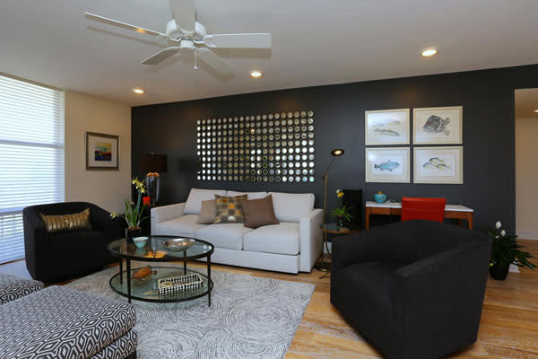
The most dramatic
Benjamin Moore Graphite. Need some drama in your life? Look no further, Graphite has you covered. It’s almost black—it’s dark and moody. It provides contrast to a light space, and in the photo below, we used it as an accent to spice up a small condo. Layer art and mirrors on top of this paint color so it doesn’t overpower the space. Just because you painted the wall doesn’t mean you’re done!
The most sophisticated
Benjamin Moore Dragon’s Breath. This is my “little black dress” of gray paint colors. It’s deep, rich and drop-dead gorgeous. In the photo below, we took a vanilla kitchen and kicked it up a few notches by painting the cabinets. They were good quality, so it would have been a shame to rip them out, but my goodness, were they boring! Dragon’s Breath is an anchoring color and gives depth. It has a brown undertone so it’s warm.

Tastefully yours,
Jill Geisdorf, RID, LEED AP
Interior Designer at Chic on the Cheap